Tuesday, 7 May 2013

My vision for the film, due mainly to the location we were shooting in, was to make a feature of symmetry. For every shot I carefully considered the framing of the subject within his environment. To me, and despite the scale of the market, the result is that the building looks to be closing in around him. The bold imagery also gives the location its own character, as I've previously mentioned this is a method inspired by Kubrick's work on The Shining.   


This is one of my favorite shots in the film. I like my decisions to track forward in both this and the previous shot, it give the sequence a natural progression when cut together while at the same time functioning as a tool to suggest an increasing intensity. Another aspect I like is how close to the lens the characters torch gets as the scene progresses, I feel it adds to the drama and allows the audience to get a better understanding of the characters emotions.


While there are a lot of tracking shots in the film I hope it doesn't come across as a film made by a film student who recently discovered the equipment and therefore used it at every available moment. When I was story boarding the film, while I wanted to imitate elements of The Shining, I wanted there to be deeper meaning to the use of tracking shots aside from the fact its visually interesting. As with the example above, I used a track and dolly either when I wanted to signify an increase of emotion. A second reason was that, as I've also mentioned, I wanted to suggest an element of voyeurism at all times, therefore, a lot of the time it was my intent to suggest a presence through the moving of the camera.

Below is one of my favorite sequences, it was a very simple concept that I feel works very well when cut together. The use of a shoulder rig was of great help for a number or shots, this one in particular though where I use a whip pan to reveal an aspect of Adams torment. The shoulder rig was also used in place of a tripod at times, furthering suggested POV and voyeurism.


Links To Films

Ten Minute Drama

Character Study

Since the screening I've re-edited the film into a thirteen minute extended cut. As I said at the time of screening, through having to cut it down I felt the film felt very disjointed. There hasn't been time to re-do any of the sound work so what you'll be watching is essentially a rough cut of how I felt the film should have been.

Re-Edit


Tuesday, 23 April 2013

DIY

A big problem with using DSLR's is that the focus ring is very hard to rotate accurately therefore pulling focus can be very hard. To solve this problem we came up with a simple solution.

 
The elastic bands can be easily marked meaning that all you have to do is run the scene, mark the focal positions, then look and match up the lines when filming a take.

Lighting On Location

The greatest challenge I faced while shooting were the various lighting set ups required for the various locations within the market. Generally speaking I was able to get away with just altering the actual lights in the market, either this or varying the ISO or F.stops. There were three scenes however that required extensive lighting, the first being the conversation between the characters Adam and John that occurs over a desk. The other two were the scenes that see Lily make extended appearances.

The grab below partly shows how I improvised a three-point-light-set-up to work around the constraints of the location. The Kino-flo on the far right acts as the back light, lighting the back of the actor, defining him against the background. The Kino-flo on the left acted as the key light, flooding the scene with natural looking light. Lastly, behind the camera, through a door, I used a Dedo lamp as a filler, reducing shadow and lighting the other side of the actors faces.


The hardest lighting challenge was the scene in which Lily makes direct contact with Adam. To sustain any of the suspense and mystery surrounding her character it was necessary to see as little of her facer as possible. I shot this scene on an ISO of 100, this allowed me to be very precise about what was being lit and when. The grab below shows how the scene was lit at the time of shooting.


These are the results.


I justified the extreme spotlight effect by the fact its never explicitly explained whether or not this scene is the characters imagination or not. The fact its somewhat of a 'dream sequence' allowed us to be quite experimental with the use of Dedo lamps.

The framing I used in this scene also relates to the fact its meant to be suggestive of a dream. Positioning Adam in the far left of the frame goes against convention however seemed fitting at the time being that it puts forward the idea that he's in fact not talking to anyone. Another reason that I now really like the decision to shoot the angle like this is the black gulf that falls away behind him. It was our intention to make the scene feel like it was possibly happening inside his head, the featureless space helps connote this desire.

Lastly, in the last scene where Adam discovers the body of Bill and a much more physical Lily we still wanted to hide her features and refrain from identifying her too much as being human. Due to constraints in regard to power supplies we had to improvise and use only one Kino-flo where as originally I would have liked to make use of a Dedo kit as well. The method we used was to hide the one light we could use in a small room off the main hallway we were shooting in and pump light though the gap at such an angle that we could light the body while keeping the monster of the scene in the shadows.


The one aspect of the light that I'm not happy with is the fact that it looks entirely fake. The glare off the painted door frame draws much too much attention to its self, this being said however, by happy accident the fact its red paint helps to connote a hellish motif, something I picked up on while shooting then in turn found a red chair to continue to theme. Overall I'm pleased with the shot we managed to achieve, however less for the way in which it matches my expectations but more for the result we achieved despite the constraints we had to over come.

Tuesday, 9 April 2013

Uniforms

After having met with our actor a number of times he made it clear that he had a strong idea of what sort of uniform he wanted to wear in the film. Rather than the standard baggy jumper, he wanted something a bit more authorative and swarve. Myself and the producer met him a number of times in army surplus stores so that we could find something that was suitable and that fitted. We settled for an ex military blazer,  finding two so that the two guards in the film could look identical. The problen with the jackets was the fact they had epaulettes and material patches that suggested military over civilian security.  To sort this, me and the producer found some textiles students to help us remove the various patches and other characteristics that suggested army origins.  Im pleased with the result and glad we went through the effort to find good looking uniforms

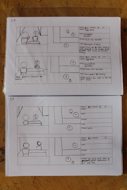
Ten Minuet Storyboards

Part of my role as cinematographer was to work out how to best represent the script visually. Unfortunately our director was away over the Easter break so it was left to me, with some help from our producer, to draw up these storyboards.


Wednesday, 20 March 2013

I Saw The Devil

I'm a big fan of Korean cinema for the way in which it's cinematography isn't restricted by the 'Hollywood' mould.

I recently watched I saw the Devil and on several occasions was inspired by a number of shots/sequences.

The first screen grab is more of a technique than a shot type, however it got me thinking as to how to catch an audience unaware and make them jump. The sequence starts with a peaceful shot of an illuminated car, the fact that the headlights are on, illuminating the car in front, lulls audiences into believing the character, whose POV this is, is safe.  


Then, very quickly, the shot whip pans to the right, revealing a man with a raised knife. In conjunction to this dramatic camera movement, sound is used to heighten the surprise factor. A simple technique such as this would easily be mimicked in my film, it's also taught me that sound is everything, in this sense my communication with the groups sound recordist/editor must be upheld as I starboard the project.  


From the very beginning its been suggested to me that the best way to introduce a new scene is though the use of an establishing shot, often a wide angle, letting the audience know what/where they are looking at. What I like most about this next sequence is the fact that this rule is reversed, opening with an extreme close up then cutting to a revealing shot. I'd like to copy this style when changing scene's in my own film.

It works in the context of I saw the Devil due to the fact that this character is almost always smoking, by this point in the film, the cigarette becomes something of a signifier for the character. Essentially, this means that it becomes more than just an interesting shot and justifies the transition into the scene. While I could through this kind of shot in anywhere in the film by way of changing scenes, it would ave less intent and therefore have less of an impact. Perhaps if there was something of significance to the plot that appeared as art direction in a scene I could use that as something to focus on before pulling back to reveal the location surrounding it.   


The screengrabs below depict a shot that tracks the to left, following the character as he crossed the road before breaking into an apartment. What I like about the shot is that unusually it doesn't follow the actor but waits until they've left frame before quickly tracking sideways as if to catch up.  

I like the idea of using a similar shot to introduce our protagonist as he starts his rounds once the market is empty. The shot would start as a static, looking down a low lit hallway, the character would then briskly walk through shot, the camera then tracking sideways, panning at the same time to reveal another hall way toward which the character is heading.

The way in which the camera seems to react to the presence of a character suggests you could be watching some kind of warped POV, appropriate given our script and subject.